
These 11 store designs shook up the world of retail – and started in Richmond
In his mid-40s, Richmond retail tycoon Sydney Lewis suffered a heart attack.
Lewis, who co-founded national retail chain Best Products Company with his wife Frances in 1958, was informed by his doctor that he was working too hard and should take up a hobby — skiing, for instance. Not one for the bunny slopes, Lewis decided to collect art instead.
It was on the advice of Sydney Lewis’ doctor that one of America’s greatest art collections was born.
At its height, Richmond-based retailer Best had more than 200 showrooms in 27 states and annual sales of $2 billion; initially, the Lewises bartered with some of the country’s leading artists, trading appliances for art.
“All of a sudden, the artists in lower Manhattan began to have refrigerators and TVs,” Tom Armstrong, director of New York’s Whitney Museum of American Art, told The Washington Post for a 1982 profile of Sydney. The barter system was purportedly abandoned after one artist requested 13 televisions.
Over the years, the Lewises donated thousands of works by Andy Warhol, Chuck Close, Jasper Johns, Roy Lichtenstein and other artists to the Virginia Museum of Fine Art. They also donated millions, alongside Paul Mellon, to create the VMFA’s West Wing.
Sydney Lewis died in 1999; Frances Lewis died last month at the age of 103.
Last month it was announced that the command post of the Lewises’ empire, the Hardy Holtzman Pfeiffer-designed Best Plaza in Henrico, would be demolished by the county.
But one of the more intriguing aspects of the Lewises’ legacy is their commissioning of innovative designs for their big box stores between 1972 and 1984. The designs make it appear as though showrooms are variously falling apart, being reclaimed by nature, or otherwise whimsically play with their role in commerce.
James Wines, the architect behind these designs, says his collaboration with the Lewises came out of their engagement with the New York art world; back then, he was primarily a sculptor.
“[Sydney] was being criticized for building big box stores — having this growing and great art collection and imposing on the public these ugly big boxes,” said Wines, 93, interviewed by Zoom from his home in Manhattan. “The whole concept behind it was to take something that no one even considered architecture. … You’re using a found object, junk architecture, really, and then transforming it.”
Wines lauds the Lewises, saying that the self-made millionaires were humble, genuine friends to many artists.
“Frances was really the business mind, in a way,” said Wines, founder and president of New York-based architecture and environmental arts organization SITE. “Sydney was the outreach, conceptual thinker, of how to run the business.”
Wines’ designs caused enough of a stir that the Museum of Modern Art exhibited models and drawings of Best Products stores from SITE, Hardy Holtzman Pfeiffer, and Venturi and Rauch in 1979; Wines’ plans are now part of the collections of MOMA and Paris’ Centre Pompidou. In May, The Branch Museum of Design will open "Imagining Best Products," a new exhibit celebrating the ideas and artifacts of Best Products.
Here is the story behind James Wines’ 11 designs for Best Products:
Peeling Building, 1971, Richmond
Wines’ first design for Best was a renovation of the retailer’s existing showroom in Southside Richmond. The idea was to make it appear as though the façade was floating off the building.
Though Best didn’t do any publicity about the renovation, it still garnered attention from the public. A hurricane hit Richmond around the time of the exterior’s unveiling; people called local newspapers to report that the façade was coming down.
“That was actually quite inexpensive, in architectural terms,” said Wines of the update. “I heard of this mortar called Sarabond. You were able to put bricks together in almost any shape you wanted because it was like glue.”
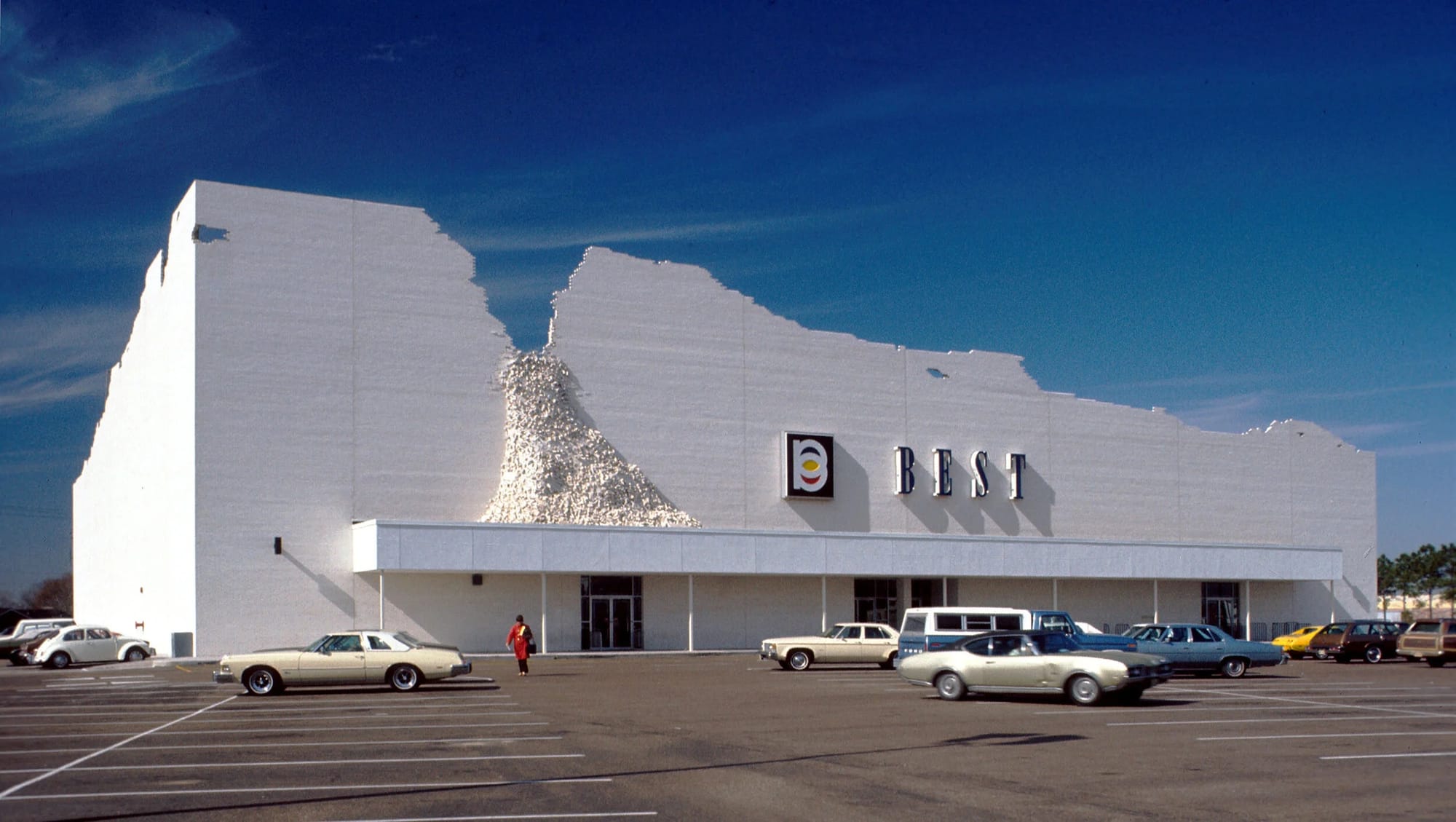
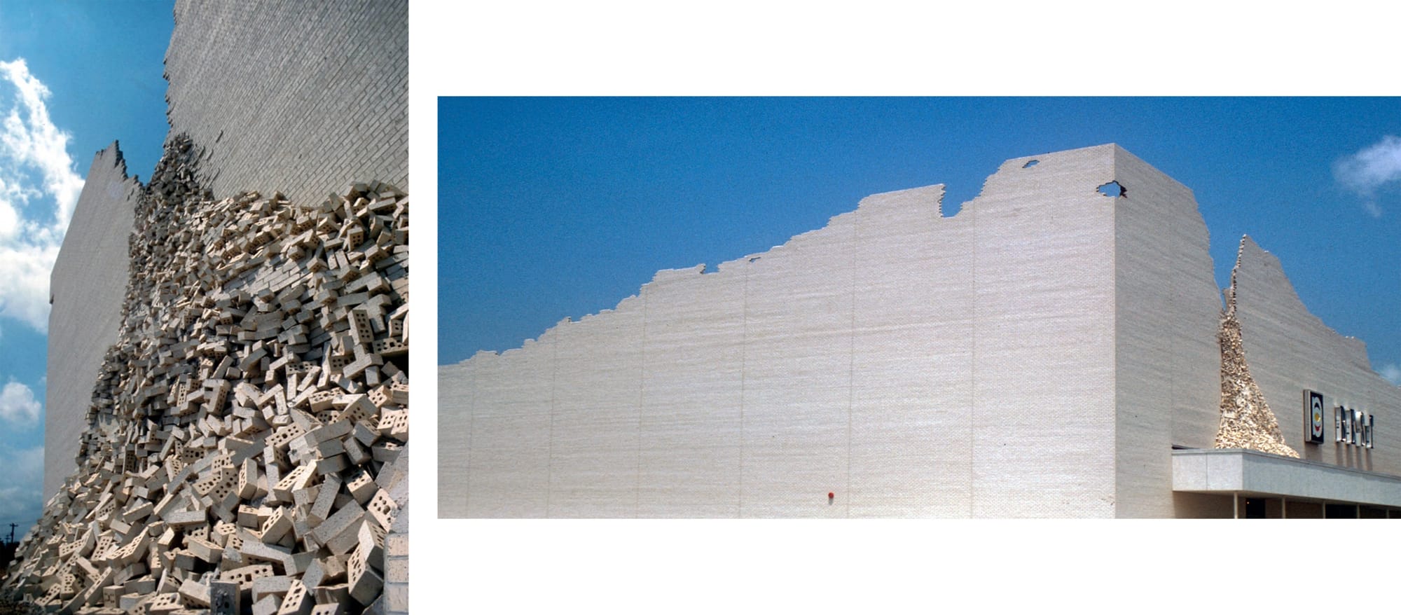
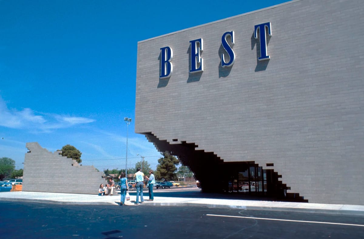
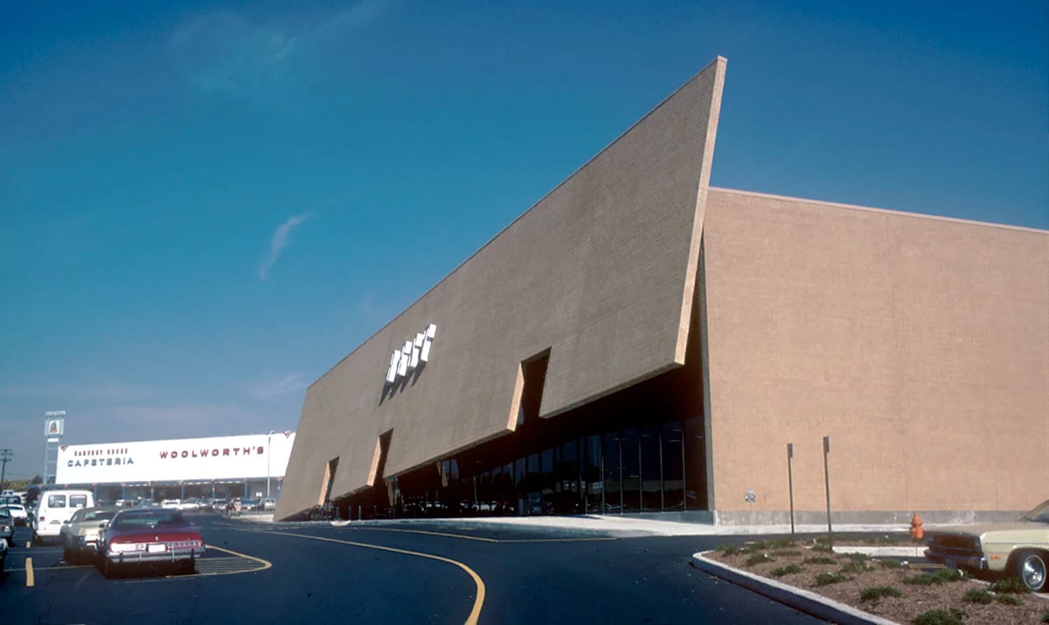
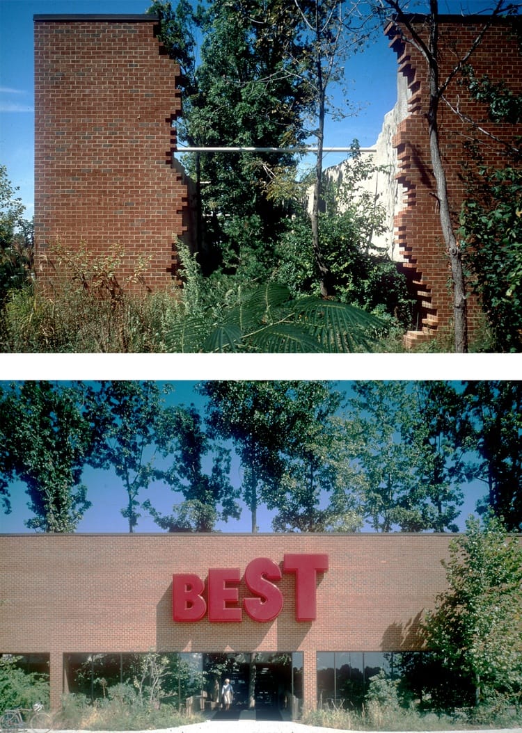
Indeterminate Façade Building, 1975, Houston
Wines’ second design looked as though a big box store had endured an earthquake. With its cascading bricks and uneven silhouette, the Indeterminate Façade Building cut quite a figure in the Houston skyline.
Wines was asked to present the design to Best’s executive staff. As much as the Lewises liked the plan, not everyone was impressed.
“Mr. Wines, if you build a building like that, no one will ever go in it,” Wines recalled one bigwig telling him.
Wines and the Lewises pressed on nonetheless. Before the opening, word got out that the new building was something wild. To create anticipation, the building was draped in black cloth. Two helicopters pulled off the covering during the store’s opening ceremony.
“There were cars lined up all the way down the highway,” Wines said. “You couldn’t even get into the parking lot.”
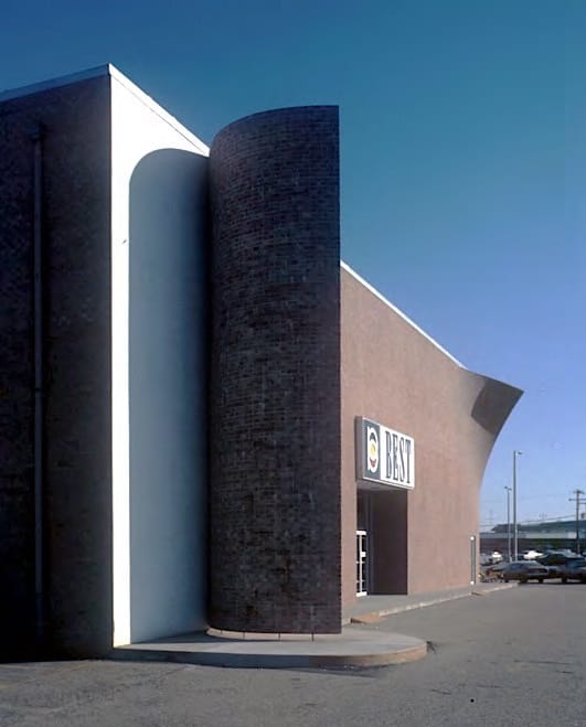
Tilt Building, 1977, Towson, Maryland
The Tilt Building in Maryland was another example of Wines and Best playing with people’s expectations of big box retail.
“The Tilt Building you saw from a great distance on the highway,” Wines said. “The buildings they built were really self-critical. You’re building a building as a critique of itself.”
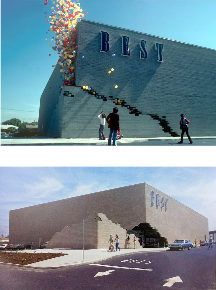
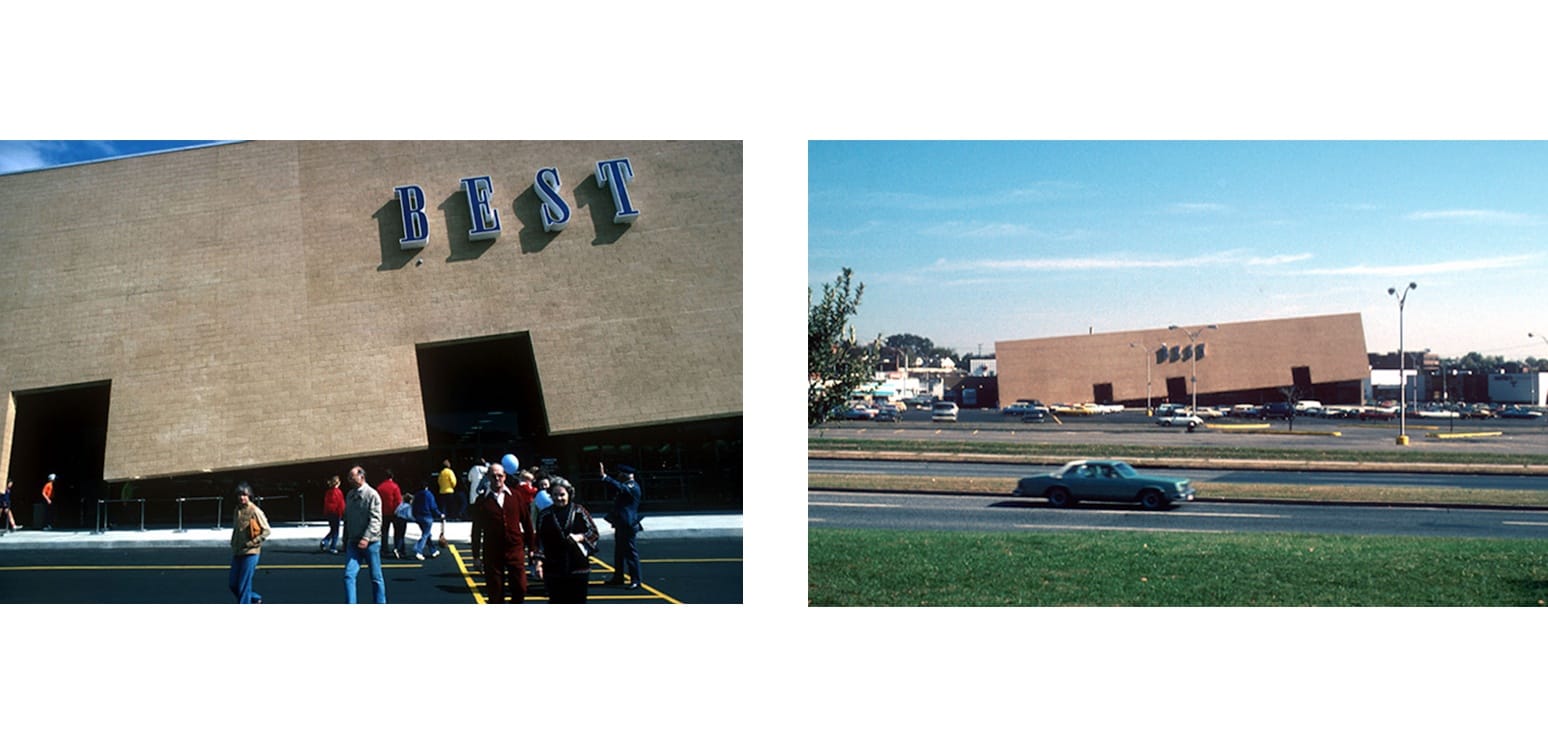
Notch Building, 1977, Sacramento, California
The playful Notch Building had a movable entrance at one corner of the store. At the start and close of each business day, the 14-foot-high, 45-ton corner wedge would move 40 feet along a track.
“It’s kind of absolute minimalism,” Wines said. “Mies van der Rohe was right: less is more. If you can reduce things to their essence and imbue them with other levels of meaning, you’re doing a lot more than something overly fancy.”
As part of the opening day ceremony, a bouquet of balloons escaped from the corner of the building when the wedge pulled back.
Wines says that late local journalist Edwin “Eddie” Slipek had “a major role” in planning the openings, as he was previously Best’s head of corporate communications. Slipek and Wines often spoke about the concepts behind the designs and how to communicate them to the public.
“We would find a way of personalizing it and making it appealing,” says Wines of the former Style Weekly and Richmond BizSense contributor who died in December. “He was the guy who thought of the idea of the balloons for the Notch Building: the audience stood still while the building moved.”
Terrarium Building, 1978, Daly City, California
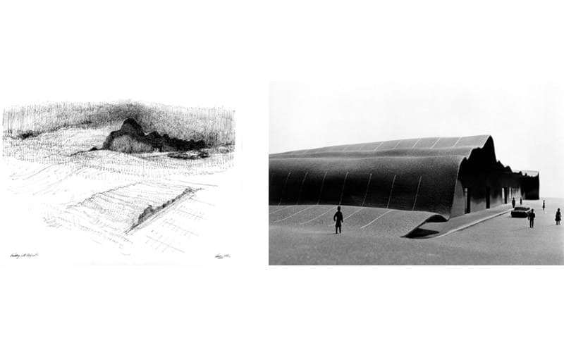
The Terrarium Building is one of two designs that weren’t realized because of their estimated expense.
Intended for a mountainous landscape in the San Francisco Bay Area, this design would have featured glass façades filled with soil from the building’s construction. The roof would have been covered in a mix of earth and regional vegetation.
“That, unfortunately, was a good idea, beautiful location, but it was too over the budget for them,” Wines said.
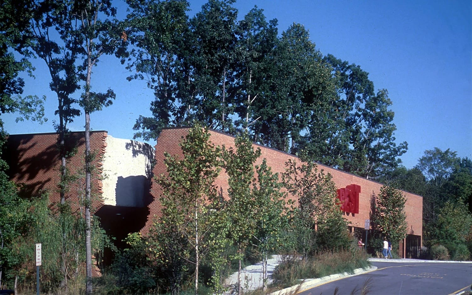
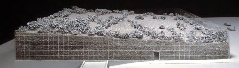
Forest Building, 1978, Henrico County
Located in a densely wooded area in Henrico, this design aimed to preserve the showroom’s surrounding vegetation.
“Instead of cutting down all the beautiful trees, let’s save as many as possible,” Wines says of the concept.
A glass terrarium wall revealed the underground geology of the hill that the building was situated on. The concept was meant to appear as though nature was taking its revenge on a big box store. The building now belongs to West End Presbyterian Church.
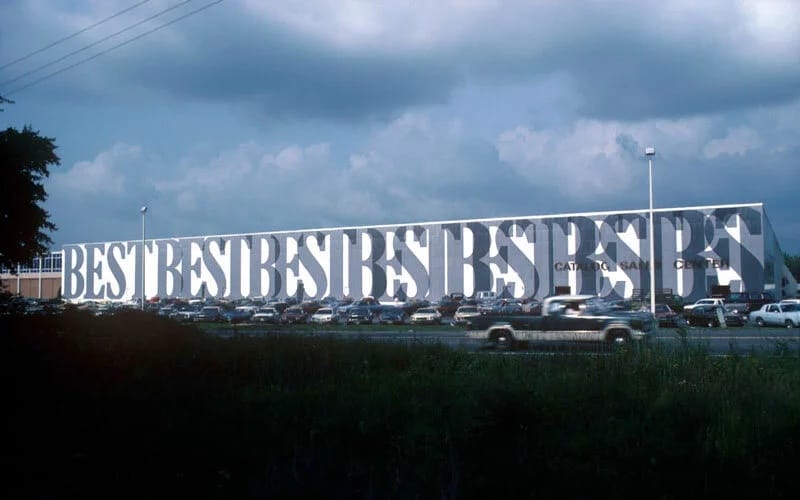
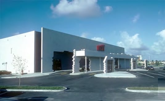
Anti-Sign Building, 1978, Ashland
In Ashland, Best operated a 75-meter long distribution center. Sydney Lewis wanted the facility to have an oversized sign sporting the company’s name, but the building actually crossed a jurisdictional line; one jurisdiction allowed a nine-meter high billboard, the other only two-meters high.
Wines devised a way around the red tape: “My idea was, when we cross the county line, we’ll overlap the letters so it’s not readable, and then it won’t be a sign,” he said.
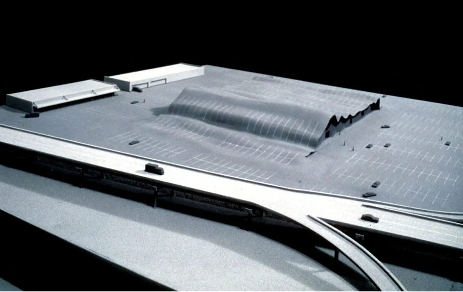
Parking Lot Building, 1978, Dallas
The Parking Lot Building was another unrealized design. Constructed of reinforced concrete, steel, cement block and asphalt, the store would appear as though it was being consumed by its parking lot.
“That would have been the most sensational of them all,” Wines said. “It was just too much over budget. (The Lewises) were still business people. They had to rationalize this to their investors and everybody else.”
Jigsaw Puzzle Building, 1979, Cutler Ridge, Florida
Designed to be visible from a nearby highway, the Jigsaw Puzzle Building was supposed to appear like a fragmented, surreal façade for a big box store.
“It was all about light and shadow, and at dusk it looked incredible,” Wines said. “It was a beautiful location in Florida. The sunlight was absolutely beautiful there. I thought it would be nice to take the whole building apart.”
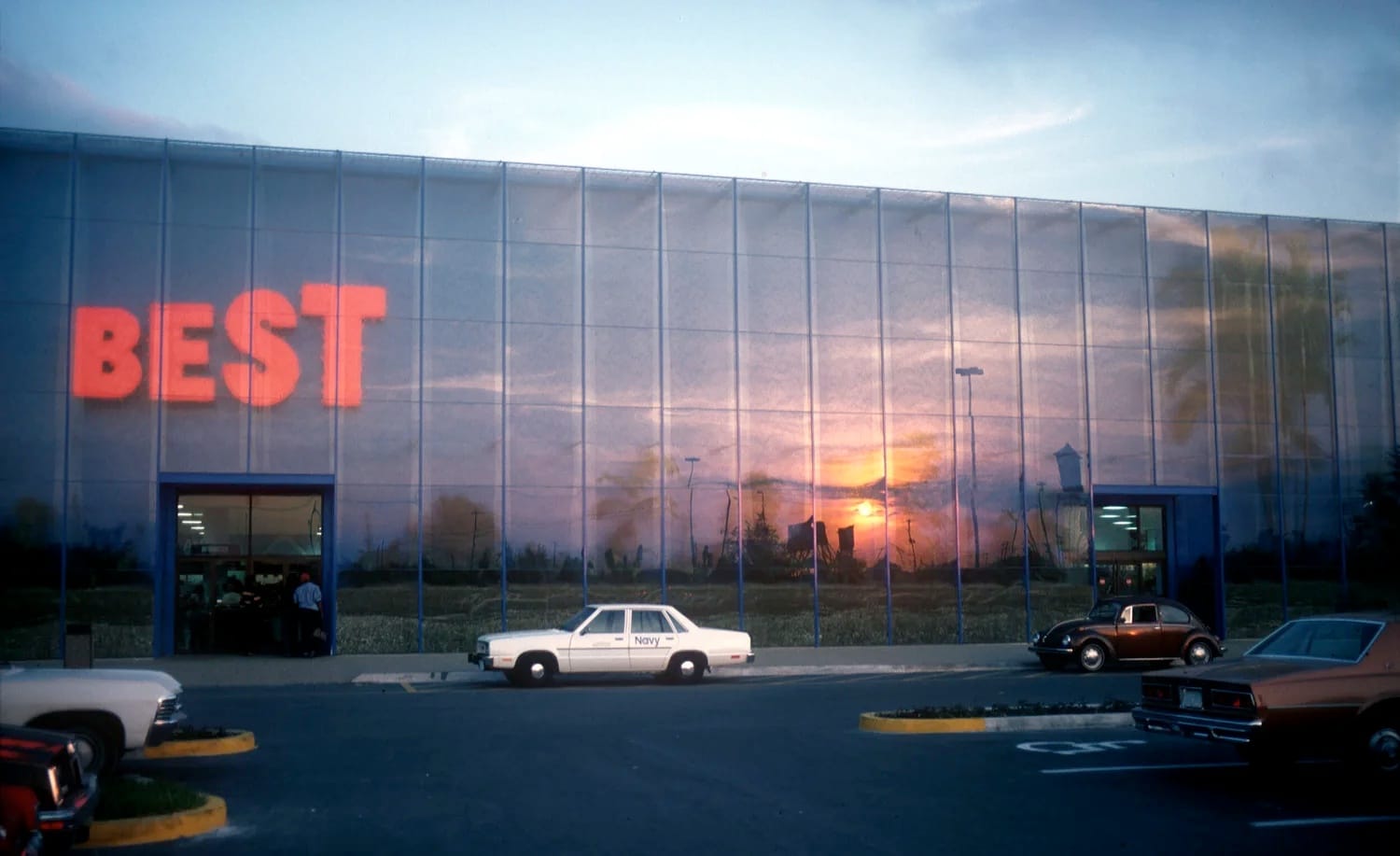
Rainforest Building, 1979, Hialeah, Florida
Furthering the idea of embracing the natural environment, the Rainforest Building included indoor vegetation and a continuous flow of water against the windows that cascaded from the roof level.
“That one always got the sunsets in the wall,” Wines said, “so you got the whole sunset in the building.”
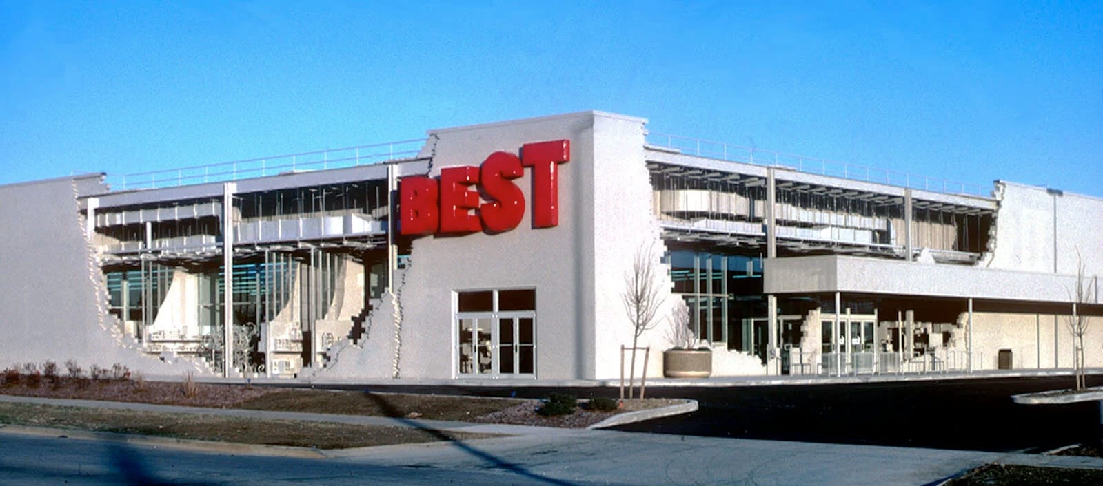
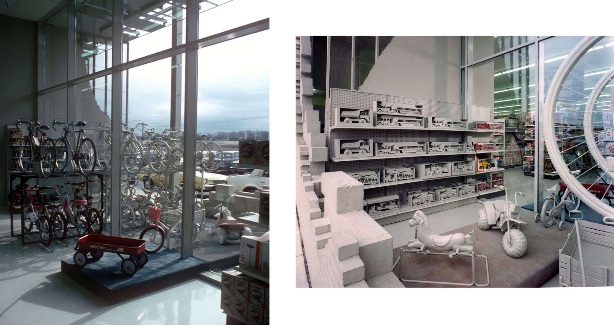
Inside/Outside Building, 1984, Milwaukee
Wines’ final design was the most expensive to be built.
“Frances said to me one time, ‘You never celebrate what we do,’” Wines said.
The comment inspired the Inside/Outside Building, a cutaway take on a big box store. Wines commissioned a Milwaukee sculptor to cast hundreds of products, then lined those sculptures up with the real-life products inside.
“The idea was just to cutaway the walls, put a thermal wall in there and just show the products,” Wines said. “It’s kind of a ghost building.”
This article has been updated with new links and information.