
Neon Moon: The story of Richmond’s own neon sign
In windows across the city there is a glowing, shining secret.
It’s a beacon in the dark — a sign of welcome, camaraderie and community.
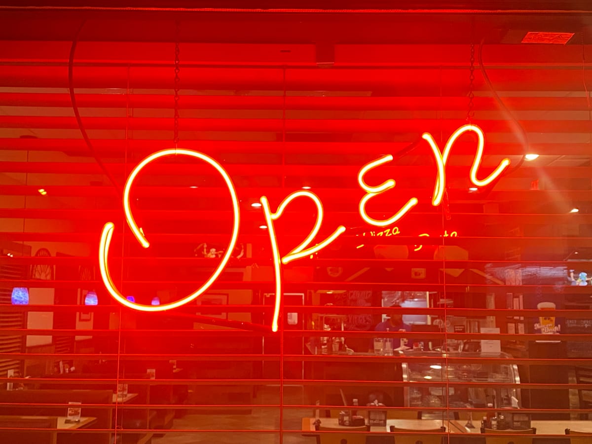
It is Richmond’s own neon open sign, a distinctive riff on the ubiquitous emblem of friendly commerce.
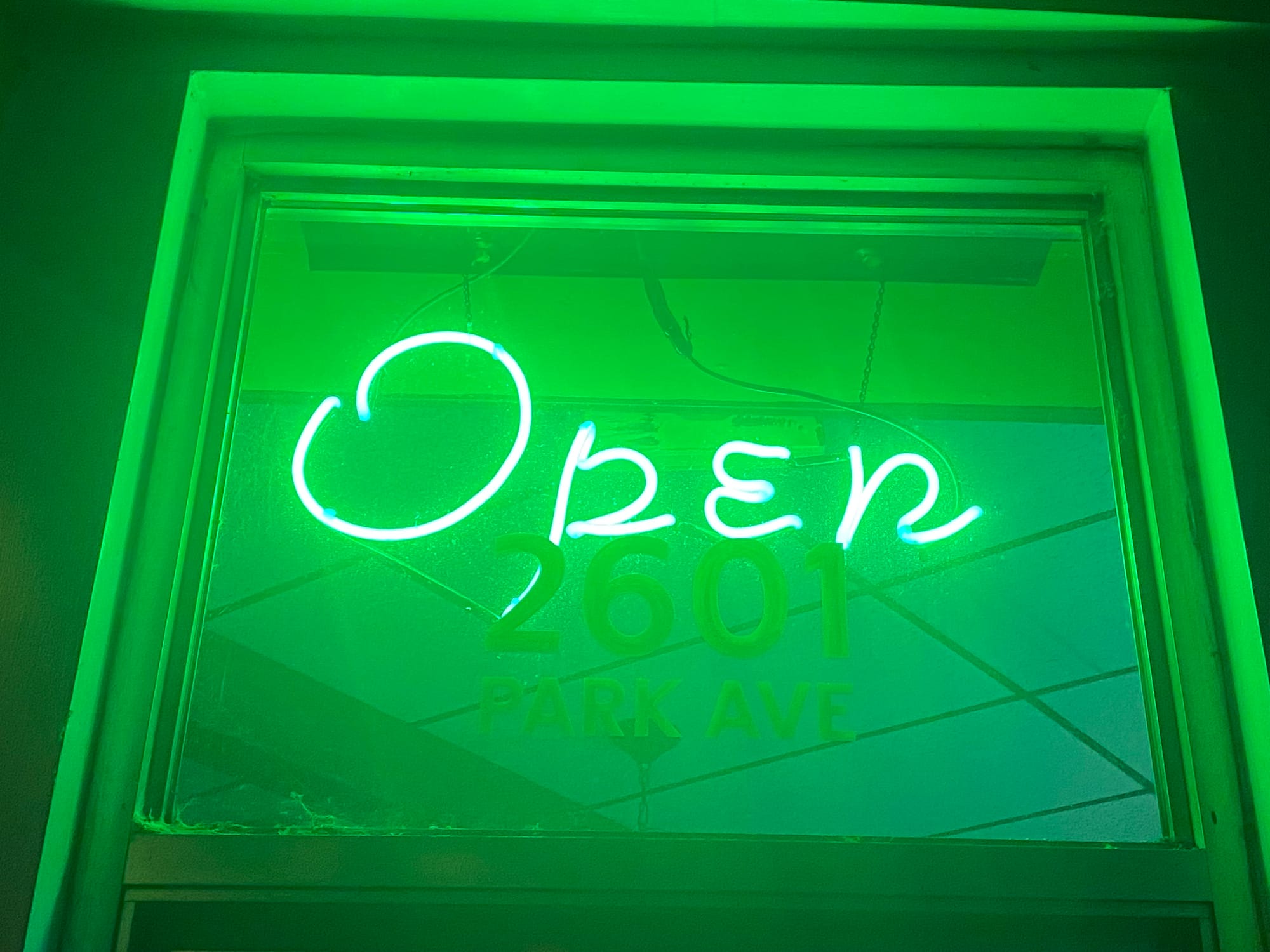
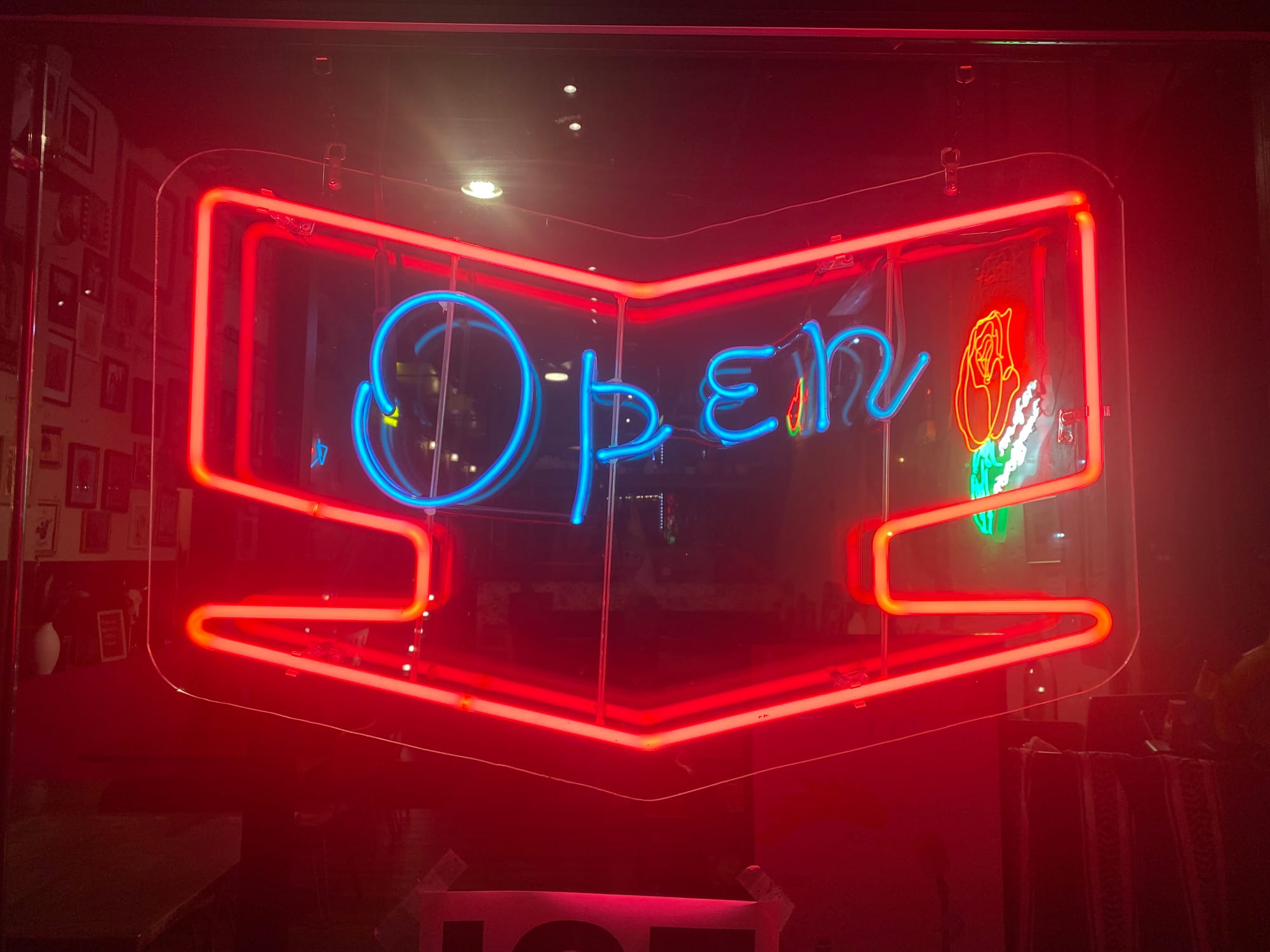
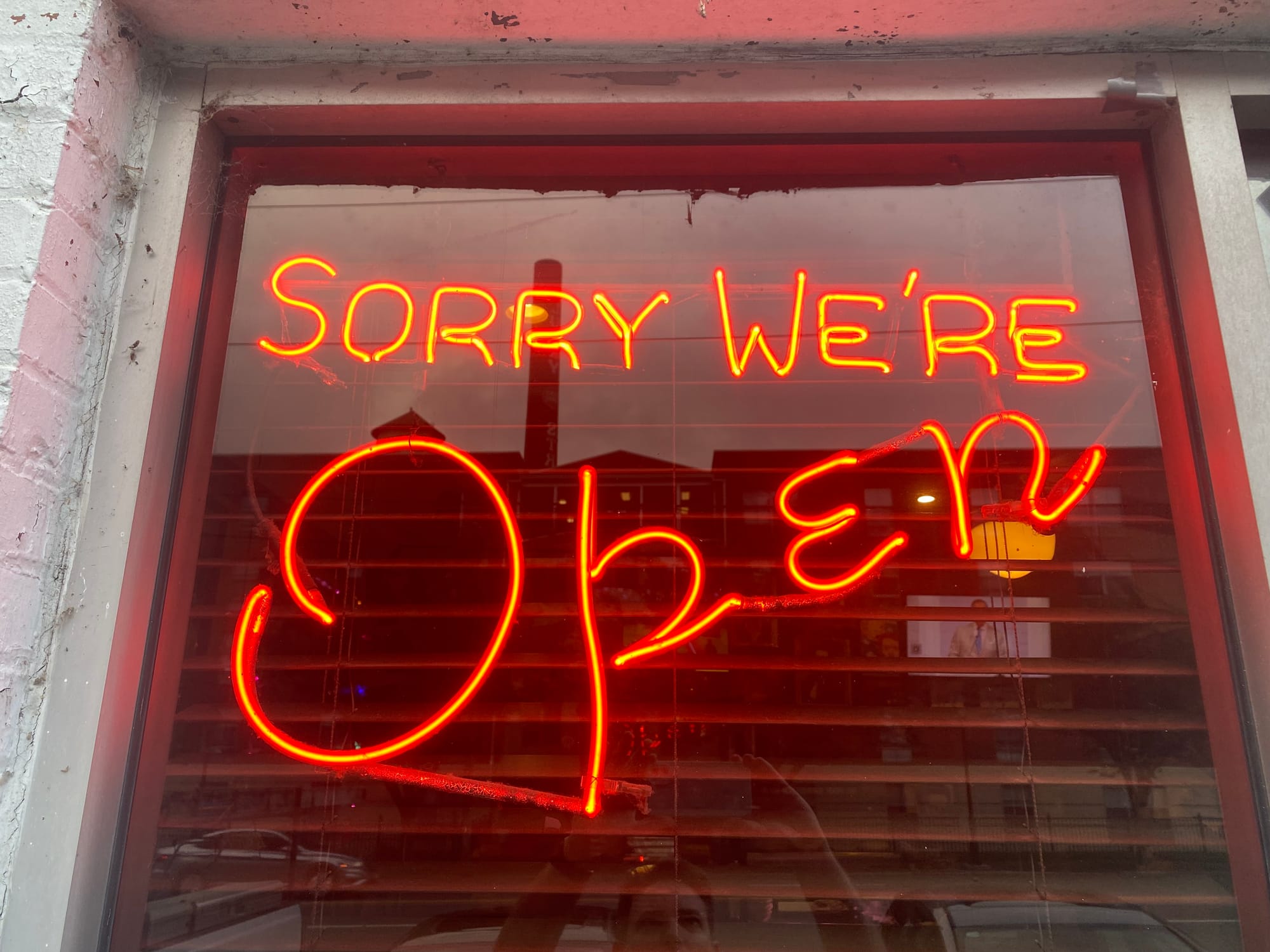
This isn’t your standard “O-P-E-N” in big block letters. Our version mimics cursive with its swirly-topped uppercase “O” followed by a smaller “p-e-n.”
An assuredly incomplete survey by this reporter counts 26 signs on display at the following locations: 821 Café, Arianna’s, Bandito’s, Black Rabbit Tattoo, Blue Habanero, Bombolini, Christian’s Pizza, City Diner, Club Rouge, Franklin Inn, Galaxy Diner, Jamaica House, Joe’s Inn Bon Air, Little Mexico, Moving Mountains Tattoo Collective, Poe’s Pub, Re-Cycles Bike Shop, Rostov’s, Sheppard Street Tavern, Stanley’s, Supper!, Tarrant’s Downtown, TBT El Gallo and Texas Inn. Both Bombolini and City Diner sport two of the signs in their storefront windows.
How did Richmond’s unique contribution to the world of neon come to be? How does it stack up against other neon creations? And, importantly, where can you purchase your own?
Sign spotting
Neon once reigned supreme.
First popularized in France in the 1920s, neon signs soon spread to the rest of the world, embodying opulence, prosperity, and, perhaps, a hint of sleaze. It represented the electric thrill of gambling in Las Vegas, announced musicals on the marquees of Broadway and lit up Tokyo’s bustling Shinjuku City.
In America, neon’s popularity was briefly dimmed by the production disruptions of World War II. But with the rise of suburbs and car culture in the postwar economic boom, businesses turned to neon to catch the attention of Americans as they drove between work and home.
Richmond was no exception to the neon craze. Talley Neon, founded on Broad Street in 1935, created most of the city’s larger neon signs. Christina Keyser Vida, the Valentine Museum’s Elise H. Wright Curator of General Collections, says that Talley initially benefitted from a small building boom that Richmond experienced in the 1930s in spite of the Great Depression.
“Talley really sort of takes the cake, and by the ’50s and ’60s they are making most of the signs in the Richmond region,” said Vida, who curated a 2023 exhibition of the Valentine’s historic signs called “Sign Spotting.”
Many of Richmond’s iconic neon signs — including the sign for The Triple pool hall that now adorns the entrance of taco joint Don’t Look Back — were crafted by Louis Rudd, Talley’s most prolific neon artist.
'Sorry, We’re Open'
Joe Parker was drawn to the neon business for its independence and solitude.
Having owned an ice cream shop in Newport News and worked as a food and beverage manager at Busch Gardens, Parker was tired of the headaches brought on by customers and drama-prone employees.
He purchased the necessary neon torches and burners, took some beginner lessons and soon began crafting glasswork of his own. After spending roughly two years as an employee of Richmond’s Tyson Sign Company, Parker formed a neon wholesale business of his own: JP Wholesale Neon.
“A lot of sign companies were calling me to do their sign work,” explained the retired 75-year-old, who now lives in Henrico. “There were very few neon glass benders in the early ’80s, and side work became more profitable than working for someone else.”
Parker created his distinctive open sign in the late ’80s. He’s hazy on the exact details of its creation, but says the sign’s lettering came from the font software Letter Art.
“I was looking for a script that was a little bit different than a block letter open sign. I came across this font called Park Avenue,” said Parker, who was pleased with his initial attempt. “It came out pretty good. It was easy to do, and I could make one pretty fast.”
Doug Solyan, Louis Rudd’s protégé and founder of Uptown Neon, was enchanted by Parker’s design. From his storefront on West Cary Street in the Fan, Solyan began selling open signs made by him and Parker.
“He probably sold most of them in town,” Parker said. “I’d sell them to one or two people and he’d sell the rest of them.”
At the time, Parker was a more proficient neon bender than Solyan and would create neon patterns for Solyan to follow.
“He became better and better through practice,” said Parker, whose neon signage also appeared inside the 6th Street Marketplace and Richmond department stores Thalhimers and Miller & Rhoads. “After a while, I couldn’t tell if Doug had made [a sign] or I made it. I can’t tell unless I get up real close and feel the bends.”
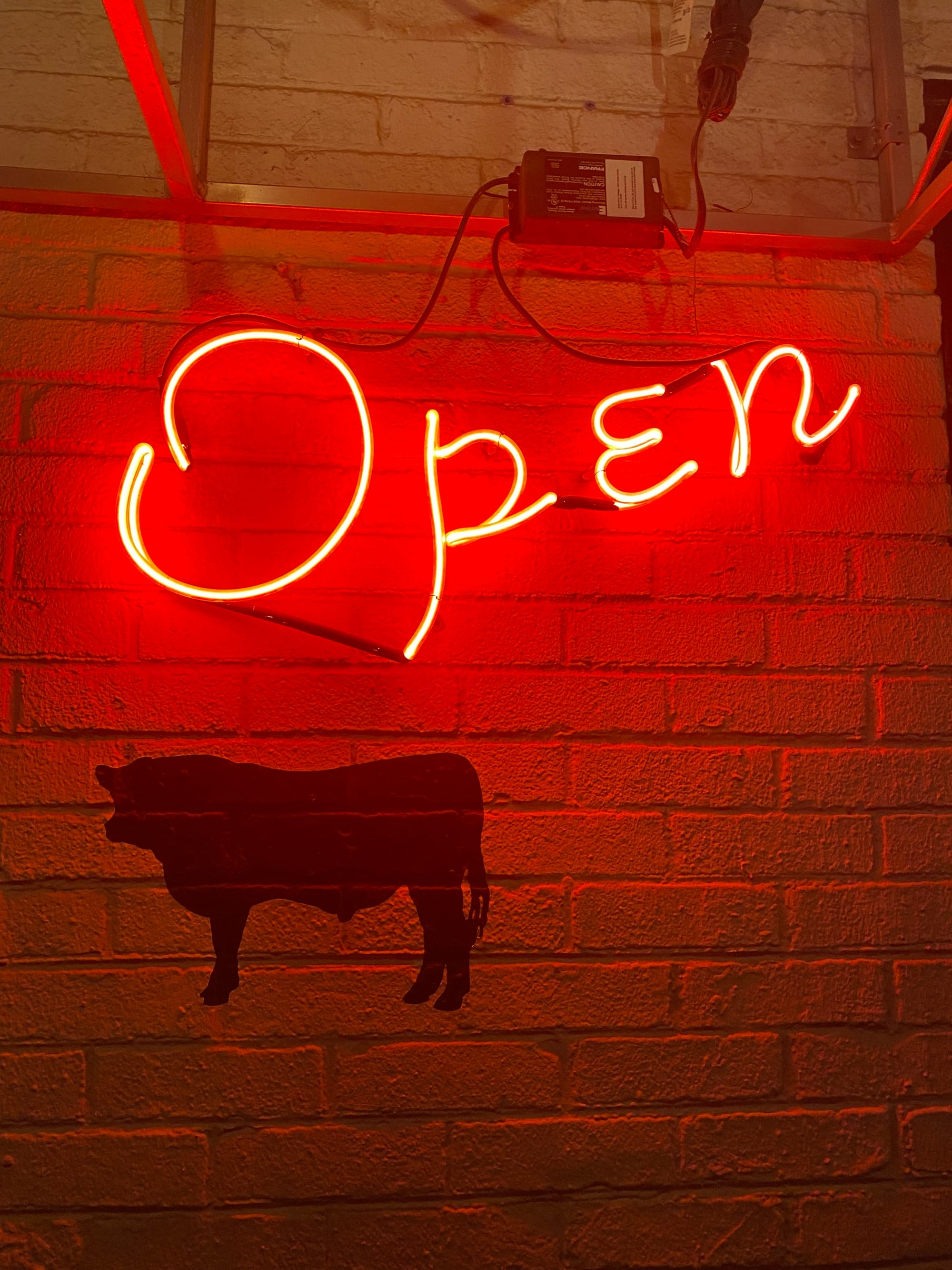
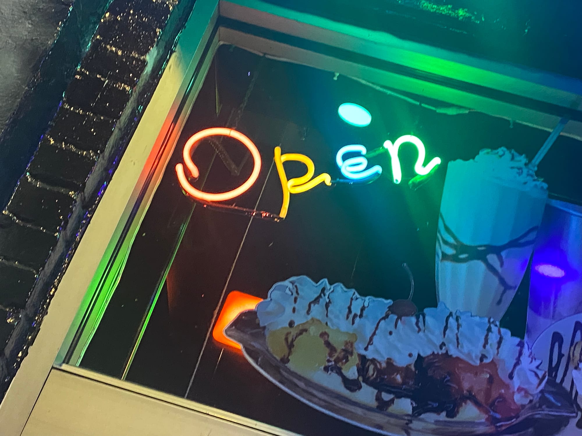
Though Richmond’s open signs share a common design, there are variations. The sign for Poe’s Pub reads “Sorry, We’re Open” in sizzling hot dog red. TBT El Gallo’s features an electric blue “Open” surrounded by a red arrow. Galaxy Diner’s sign appears in four different colors above window decals for a milkshake and a banana split. And the red lettering of Sheppard Street Tavern’s “Open” is encased in a canary yellow whorl.
While it’s possible that a couple of Parker or Solyan’s creations has escaped the River City, it’s essentially a Richmond sign. Three national neon experts say they haven’t seen a sign like it anywhere else.
“That is definitely a cool open sign,” lauded Dydia DeLyser, a researcher who co-wrote the 2021 book “Neon: A Light History.” “I can’t say it’s specific to Richmond. I would have no way of knowing that. It could be true if it were made by a particular tube bender in Richmond. I’ve certainly never noticed one exactly like this one.”
Michael Blazek, co-author of the book “Neon: The Next Generation,” also says it’s a novel design.
“I cannot remember seeing one in this font before,” he said. “Not only may it be unique to Richmond, it might even be unique to the glass bender who made them. We often keep a nice pattern or layout and use it for the next customer who wants that [design].”
Len Davidson, a retired neon designer and author of the book “Vintage Neon,” says that while it was common for individual shops to create their own neon signs, he’s never seen one exactly like Parker’s.
“It’s certainly not a different or unusual kind of lettering. It’s unusual in that it’s not a straight block lettering and it’s not straight script lettering, so it’s got that going for it,” said Davidson, who previously operated the Neon Museum of Philadelphia. “It’s unique in the sense that so many people have it.”
As for the font that inspired Parker, Park Avenue is a distinctive script design created circa 1933 by Robert E. Smith for American Type Founders. Laura Chessin, an associate professor of graphic design at Virginia Commonwealth University and type designer, says that the font gained popularity just as America was emerging from the Great Depression and advertising was on the rise.
“This is a time when you begin to see magazine publications and consumables,” she said. “Park Avenue became this really elegant typeface that was used for invitations and cigarette packages.”
Chessin notes that Park Avenue is a script font, intended to mimic the movements of a stylus with both thick and thin lines.
“Scripts are really an iteration of handwriting,” she said. “That’s what’s cool about using that for neon because it gives a panache or a whiff of luxury. By naming it Park Avenue it’s really cool and exclusive.”
One of Park Avenue’s quirks — which is reflected in Parker’s neon — is that the lowercase “E” is a smaller version of an uppercase one, instead of appearing as a lowercase cursive.
Chessin says Parker’s neon interpretation is better understood as a riff on Park Avenue, especially with the loss of the thick and thin lines of the script font.
“This is an especially interesting mutation: how in some ways the actual design itself isn’t translated, but a strange little eccentricity gets translated,” she said. “It’s pretty funky. The ‘p’ is pretty weird, the interpretation of it.”
A sign of the times
Chloe Kottwitz has picked up the neon mantle from her predecessors.
After finishing her BFA in Art and Design at The New York State College of Ceramics at Alfred University in 2021, the New York native moved to Richmond to study under Solyan at Uptown Neon. Her mentorship lasted until Solyan’s sudden passing half a year later.
“He was great. He was really patient with me,” recalled Kottwitz, sitting in Uptown Neon’s showroom on West Cary Street. “He was a great storyteller. He was a great salesman. What I can still hear in my head, when something would go wrong for some reason: ‘Aw, s—fire.’ I always thought that was funny.”
Solyan’s widow let Kottwitz run the business for a year before selling it to her. Now she’s essentially the only game in town. Though Talley still services existing neon signs, it no longer has a neon bender on staff who can create new ones. Local sign company Wellcraft MFG designs, fabricates and installs neon signs — including the recently installed signs for Carytown and New York Deli — but partners with an out-of-state bender to bring the neon to life.
It’s a sign of the times. Neon is expensive and LEDs are cheaper to manufacture, to maintain, and use a fraction of the energy. Practically all backlit plastic signs for businesses — such as those advertising Burger King and Wendy’s — have replaced the neon lighting behind them with LEDs.
Last year, two of America’s most famous neon-lit landmarks, 30 Rockefeller Plaza and the Apollo Theater, received the OK of New York City’s landmarks commission to replace their neon tubing with LED versions. So many of Vegas’ neon signs have gone dark that its Neon Museum, a repository for retired signs, has become a popular tourist attraction.
At least for Kottwitz, there’s plenty of demand: she has a six-month backlog of commissions.
“So many shops have closed up that I’m the only one,” said Kottwitz, who still has a few Richmond open signs for sale. “There’s still a need.”